Description
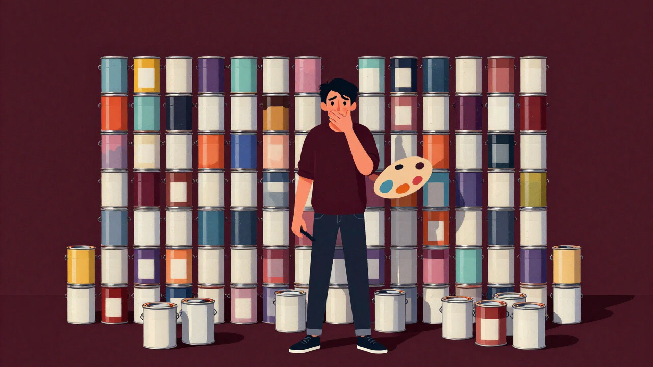
Color coordination is the lofty act of arranging infinite hues to flaunt one’s taste, yet in practice often a mere excuse to conceal mistakes. Most people fear adventure and retreat to the safe triad of black, white, and gray, chasing the illusion of aesthetic balance. Praise bestows the designer’s crown, failure is justified under the banner of ‘individuality.’ In reality, one is tormented by minute adjustments of hue and saturation, and the final judgment rests on internal biases and the number of likes on social media. All of it entrapps us in the illusion that a ‘visually comfortable palette’ actually exists.
Definitions
- A societal get-out-of-jail-free card to retreat into safe monochrome.
- A lofty pretext for debating color compatibility, yet merely the imposition of personal taste.
- A tiny canvas serving as an excuse to admire a colorful world from afar.
- A jargon barrier erected between designers and the layperson.
- A psychological puzzle paralyzing decision-making through an abundance of choice.
- The ultimate weapon to criticize single-color attire, doubling as a trap that invites conservatism.
- A never-ending adventure seeking the ‘correct’ palette that remains perpetually unattainable.
- A ritual that masks unconscious bias by relying on the color wheel.
- Billed as giving visual comfort, yet truly a slave to personal preference and trends.
- The more vociferously one proclaims color balance, the more one paradoxically exposes their ignorance.
Examples
- “Your room’s color scheme? Safe bet gray and beige. Neither praise nor criticism will ever come.”
- “Your sense of coordination? Did you realize it’s judged only by like counts?”
- “A rainbow-colored dress? Too bold; nobody has the guts to wear it.”
- “The golden ratio of color? Want me to show you it’s just a random number someone pulled out?”
- “Brand color guidelines? They’re just sloppy manuals for selling ’taste.’”
- “Day-long meeting on paint colors? By the end, everyone’s color-phobic.”
- “Instagram-worthy palette? Tell me why it won’t suit a real living room.”
- “Color theory class? More like a show-off fest for the verbally gifted.”
- “This logo’s palette is ’edgy’? Edginess here just means chasing likes.”
- “Master color coordination and you become someone who stares at palettes all day.”
- “Her color advice? She only pushes black to make your room gloomier.”
- “Color tools? Their ‘recommended’ palettes are the worst offenders.”
- “That café’s colors are ‘cute’? So bland you won’t even notice them when seated.”
- “Color workshop? A pompous bragging session full of theoretical jargon.”
- “Presentation slides? Nothing beats PowerPoint’s default theme.”
- “Chasing trend colors? You’re doomed to be pursued, not the other way around.”
- “Choosing curtain colors? A mismatch invites your spouse’s wrath.”
- “Want compliments on your outfit palette? Just outsource your taste to someone else.”
- “Website palette? Just a gray gradient pretending to be modern.”
- “Confident in your palette? A $5 can of paint will ruin that facade instantly.”
Narratives
- A single-pixel debate on wall paint colors froze the conference room into silence.
- With every new trend chased, the market paradoxically floods with the same three hues.
- In the quest for the perfect palette, only towers of unused color swatches remain.
- DIY enthusiasts gain fleeting confidence with each repaint, then require excuses for every color mishap.
- Designers who revere the wheel often unsurprisingly insist on imposing their own preferences.
- Following the palette app’s advice, the living room took on the sterile feel of a mobile home.
- Brave souls choosing unheard-of schemes find themselves engulfed in social media debates.
- Overwhelmed by choices, customers surrender with ‘Just pick for me,’ then regret it.
- Staring at swatches in hand becomes the perfect alibi to avoid making any decisions.
- A mismatched corner palette lurks at the edge of your vision, an unsettling presence.
- Adopting trend colors only ensures no one speaks of them six months later.
- Wall color choices become quiet acts of rebellion, the comment section of family discontent.
- A red accent offers fleeting passion, then etches regret in vivid memory.
- An impulsive palette choice can unwittingly seize control of a room’s atmosphere.
- Even the most painstaking palette will shift to dull tones with a change in lighting.
- Designers tout color harmony while clients dismiss it as ‘stupidly outdated.’
- Each color psychology read deepens the chasm between theory and reality.
- As palettes are arranged in ceremony, one confronts personal indecision head-on.
- Before the final palette emerges, external reviews have already shaken your resolve.
- Memorizing chart numbers won’t help you master the true essence of taste.
Related Terms
Aliases
- Hue Emperor
- Colorful Con Artist
- Saturation Fiend
- Palette Addict
- Tone Harasser
- Chromatic Wanderer
- Chart Devotee
- RGB Theologian
- Scheme Manipulator
- Color Harassment Officer
- Mono-Phobe
- Saturation Prisoner
- Hue Watcher
- RGB Judge
- Ratio Junkie
- Palette Tripper
- Color Overlord
- Chaos Chromatist
- Palette Maniac
- Chroma Paranoid
Synonyms
- Color Cult
- Appearance Supremacy
- Hue OCD
- Palette Game
- Scheme RPG
- Saturation Lab
- Color Council
- Chromatic Ego
- Hue Bias
- Visual Overdrive
- Chroma Flex
- Sight Phobia
- Color Debate
- Palette Marathon
- Harmony Illusion
- Hue Hunter
- Chromatic Trap
- Color Balancer
- Saturation Stage
- Visual Maniac
Use the share button below if you liked it.
It makes me smile, when I see it.