Description
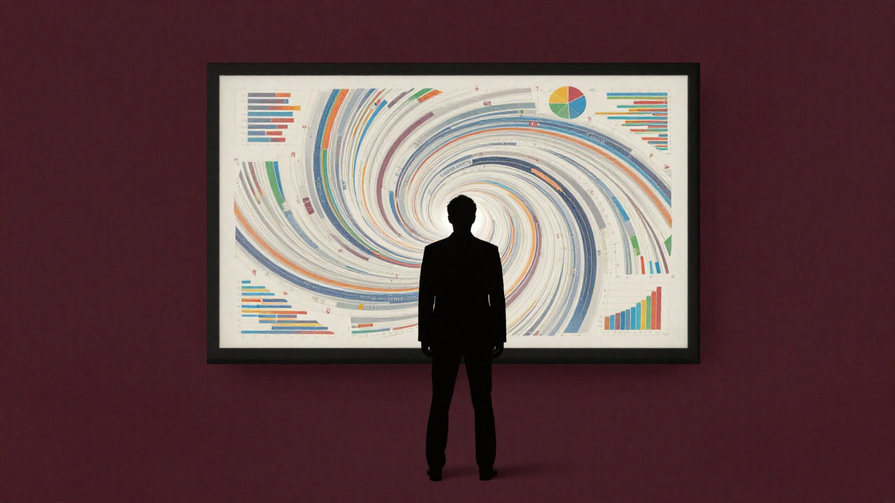
Data visualization is the art of adorning a vast array of numbers with colors and shapes to stage a fountain of insight. In reality, the aggregation methods and biases lurk in the shadows, while only the visual effects bask in glory. Do the arcs of a graph tell truth or merely serve presentation theatre? Behind the applause in boardrooms, metrics are nothing more than puppets dancing to a designer’s tune. Every time executives point at a chart, they tailor-fit a sense of assurance and illusion.
Definitions
- The alchemy transforming raw heaps of numbers into deceptively chic graphs.
- A sensuous chart show adorning boardroom walls to convey earnestness.
- Visual magic that conceals complex correlations behind a simple trend line.
- The art of banishing numerical contradictions backstage and narrating with sleek curves.
- A form of hypnosis business jargon calls ‘insight’.
- An instant answer machine converting real data questions into visually appealing shapes.
- A device that transparently hides underlying uncertainties, leaving a false sense of confidence.
- The graphical collateral that underwrites presenter swagger and audience assurance.
- A cost-heavy technique sacrificing complexity under the guise of readability.
- A visual flotation device that lets you safely swim through seas of information.
Examples
- “Wow, this chart slopes upward perfectly. By the way, did you check the raw data?”
- “If you want sales to look like they’re booming, play with the y-axis scale.”
- “Relying on charts for strategic decisions? No wonder they’d hire a visual magician.”
- “Is it true the more colors you add, the more convincing it becomes?”
- “Just the term ‘visualization’ makes you feel smarter, it’s mysterious.”
- “Still thinking a glowing dashboard equals safety? Time to graduate, folks.”
- “This bar graph is based on only five samples… no one’s the wiser.”
- “No matter how many slides you have, you need a chart on the first page to start.”
- “They say the data viz team uses healing music as BGM.”
- “My graph is Instagram-worthy, so the execs can’t look away.”
- “Scatter plot for distribution? Actually, we didn’t scatter anything.”
- “3D charts: the magic trick to instantly elevate your tech cred.”
- “5% year-on-year growth is moving… for a limited sample.”
- “Heard you can take the rest of the month off just by making a chart.”
- “Implementing viz tools is just our insurance policy, really.”
- “Pie charts are cute by virtue of being round… intuitive viz.”
- “They say the more legends you have, the more like an expert you seem.”
- “This line is random noise but somehow looks like a trend.”
- “Visualization is, after all, the perfect tool for showing off.”
- “Every time someone tweaks a color, the conclusion subtly shifts—that’s how it works.”
Narratives
- The colorful pie chart projected in the conference room dissolved every doubt like a secret potion.
- Numerical contradictions vanish in the face of gradient magic.
- The analyst tweaks hues today amid the dilemma of sacrificing readability or truth.
- Executives found solace in the chart’s beauty and abandoned deeper questions.
- Implementing a viz tool triggers the peculiar phenomenon of the process becoming the goal itself.
- Behind the glamor of data visualization lie endless battles over font size and legend placement.
- ‘Presentation quality is everything’ serves as the ultimate get-out-of-jail-free card.
- A real-time dashboard is a stress elixir concentrated in urgency and purpose.
- There’s no safer self-satisfaction than spending hours crafting a 3D chart no one ever sees.
- The data viz team is a band of drifters surfing the sea of numbers, collecting shards of reality.
- With every set of colorful bar graphs, someone’s skepticism is given temporary life.
- By the end of the meeting, the number of charts becomes a metric of one’s corporate status.
- No one appreciates the artisan’s toil in a chart generated with the click of a button.
- The daily-updated dashboard is a habitual offender robbing engineers of sleep.
- Striking visuals steal trust from reality before the truth itself.
- Invisible gaps in data are easily filled by upping the saturation.
- PowerPoint craftsmen delude themselves into believing they’ve changed the world with shapes and arrows.
- The viz tool manual is a repository of untold stories after language was abandoned.
- Limited metrics serve as a universal canvas inviting infinite interpretation.
- It’s ironic that visualization is not the key to unlocking questions, but the lock that shuts them.
Related Terms
Aliases
- Alchemy Graph Machine
- Chart Con Artist
- Coloring Sorcerer
- Visualization Mafia
- Gradient Emperor
- Visual Astrologer
- Legend Overlord
- Pie-Monger
- Bias Concealer
- Numeric Ball
- Illusion Plot
- Rainbow Hypnotist
- Data Mirage
- Axis Shifter
- Circular Ruler
- Slope Baron
- Diagram Clown
- Graphic Brainwasher
- Monochrome Phobic
- Line Lord
Synonyms
- Visual Illusion
- Shape Doping
- Topic Diversion Device
- Optical Persuader
- Bar Graph Hypnosis
- Pie Chart Curse
- Chart Magic
- Info Amusement Park
- Display Glam
- Numeric Circus
- Trend Amplifier
- Color Deception
- Data Mascara
- Surface Analysis
- Info Fraud
- PowerPoint Parade
- Curve Temptation
- Graph Phantom
- Visual Trap
- Illusion Graph
Use the share button below if you liked it.
It makes me smile, when I see it.