Description
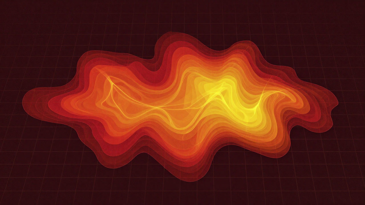
A heatmap claims to visualize data intensity as if revealing the planet’s temperature, serving as a chromatic director that highlights both triumphs and failures at a glance. In reality, it functions as ritualistic color sorcery that spotlights convenient zones for interpretation and managerial appeasement. Whether click-through rates, user interactions, or budget allocations, all bow before the glowing red areas. Essentially, it is a visual excuse to condense vast numbers into intuitively misleading narratives.
Definitions
- A ritual map translating numerical heat into color gradients, guiding decision-makers into a chromatic labyrinth.
- A color drama projecting hopes and fears onto the surfaced intensity of data.
- An illusionary map of convenience, color-coded to confirm observer bias.
- A secretive color scale brewed from hidden algorithms and managerial tastes.
- An alchemical display that conceals both success and blame behind red and blue contrasts.
- A visual deceit that elegantly masks data noise and omission with impactful hues.
- A one-image poison compressing massive logs and inducing the analyst’s false ‘trend revelation.’
- An insight-generating mirage, in truth stoking more questions and burning through report nights.
- A color mask that blurs the boundary between predictability and uncertainty, feigning reassurance.
- An ostensible final deliverable that morphs its palette to flatter supervisory judgment.
Examples
- This heatmap’s red zone looks like the fasting employees’ souls.
- Boss: Can we make this area blue? Analyst: Your budget will turn blue, too.
- Team: Users drop off here. Executive: Then change the color.
- They say heatmaps reveal everything but no one can explain the rule.
- That page is red whether from zeal or failure and the designer gets the blame.
- Invest in red spots now and next month green will be too little.
- You feel smart looking at the chart but the heatmap offers no guarantees.
- A perfect visual tool to persuade without actual action.
- Last week’s heatmap turned everything red when the data overflowed.
- Insights achieved by nice colors alone satisfy no one.
Narratives
- At the project meeting silence fell before the swirling reds and oranges of the heatmap.
- When the analyst declared trends visible the executives silently demanded a color shift.
- Before a heatmap quantitative debate and qualitative instinct wage equal warfare.
- Gaze at countless cells for truth and find only the creator’s bias.
- Those who believe data’s honesty worship the power of color.
- The blazing red zones signal fear’s beacon not hope’s flame.
- Each morning the new heatmap is sacrificed at the altar of reports.
- Under visualization’s guise countless decisions hinge on a single hue.
- Manipulating gradients in optimization resembles modern alchemy.
- The statistical truths proclaimed by heatmaps often morph into the interpreter’s desires.
Related Terms
Aliases
- Color Mage
- Visual Brainwasher
- Bias Booster
- Frenzy Inducer Chart
- Spectrum of Illusion
- Mystery Thermometer
- Executive Mood Meter
- Data Inferno Zone
- Emphasis Enforcer
- Gaze Directing Tool
Synonyms
- Red Zone Generator
- Engagement Ringleader
- Temperature Fallacy Map
- Emphasis Color Layer
- Stained Bias Chart
- Insight Mirage
- Colorful Excuse
- Attention Funnel Chart
- Numeric Vanity Map
- Visual Excuse
Use the share button below if you liked it.
It makes me smile, when I see it.