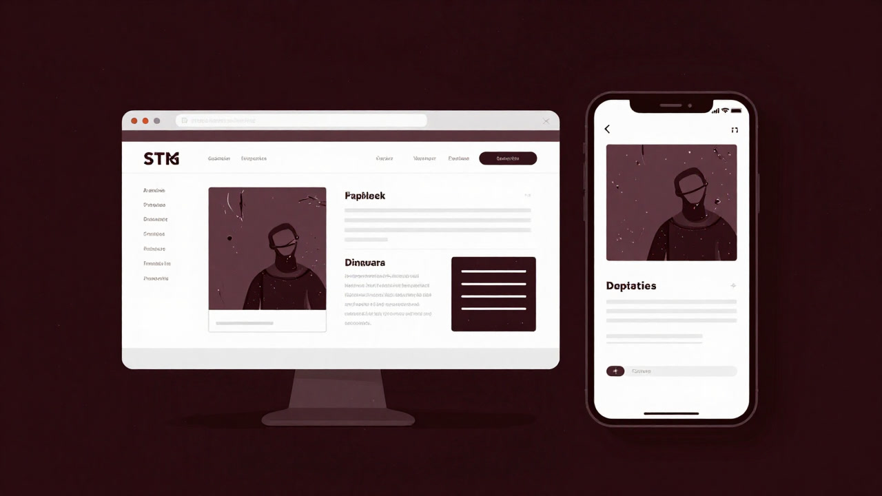
Description
Responsive design is the technocratic ritual that harmonizes with the ever-whimsical screen sizes of users. It professes universal adaptability while spawning countless bugs and conflicts like a mischievous sprite. It mirrors a developer’s aesthetic dreams against harsh real-world constraints, orchestrating a PM’s grin and an end-user’s exasperated frown in perfect unison. Once lost in the CSS labyrinth, no one returns to the same code, forever praying under a downpour of media queries. The brief moments of perfection are usually proof that someone has given up.
Definitions
- Proclaims equal treatment for all devices while actually mass-producing unexpected misalignments in abundance.
- A black hole that offers developers infinite tweaks and never-ending testing chores.
- A storm of media queries defiling the sacred rite of user experience with per-viewport version management.
- What starts as ‘mobile-friendly’ often devolves into a spiraling scroll down to one’s soul.
- Modern ambiguous art that prioritizes conceptual compromise over pixel-perfect beauty.
- The virtual glue that fills the gap between a designer’s vision and an engineer’s reality with fluid layouts.
- A graveyard of CSS class names formed by the sighs of QA testers.
- A curse with memory-wiping capabilities that prevents recalling any previous layout once applied.
- The moment something ’looks perfect’ is often the secret surrender of whoever implemented it.
- A time-capsule architecture designed to leave future maintainers in eternal agony.
Examples
- “You said it’s responsive, but the heading jumped off the screen on my phone!”
- “Looks perfect on desktop… wait, on mobile it’s a vertical labyrinth.”
- “They complained there was no tablet support, yet nothing gets fixed anyway.”
- “Thanks for RWD—my CSS just increased by 500 lines!”
- “Adding a media query spawns a new bug multiverse.”
- “Responsive design? That’s just an ideal, you know.”
- “Every time the viewport changes, the UI starts dancing—dizzying.”
- “Perfectly responsive? Only the gods know.”
- “I heard you find salvation when you give up on CSS—any truth to that?”
- “What’s a viewport? A new religion?”
- “Supporting phone, tablet, PC… doubled development time, thanks.”
- “Designers cry, engineers despair.”
- “The moment we made it responsive, a bug was deployed.”
- “Users just choose their screen width and we’re blamed—odd, isn’t it?”
- “Flexbox will solve it? Let’s chant that unknown spell.”
- “It won’t work just by copy-pasting!”
- “Bootstrap? Thought it was magic, turned out a torture device.”
- “Caring about every device is now a kind of occupational disease.”
- “I’m cursed with headaches when checking responsive layouts.”
- “Who’s ignoring the viewport width again?”
Narratives
- Each time the browser resizes, the UI collapses into a modern art installation.
- Developers were trapped in an endless responsive-design purgatory in the twilight office.
- The proudly launched page crumbled into overlapping text on smartphones, triggering a barrage of apologies and fixes.
- With every added media query, the code swelled into a maze beyond anyone’s comprehension.
- Implement tablet support and watch the desktop layout implode, answers remaining undefined.
- Each UI overflow past the viewport elicits a QA tester’s scream cutting through the silence.
- When ‘Responsive Optimization’ dances on the specifications, a project’s demise is near.
- Every time a user rotates their device, a new bug is born.
- Developers exhale in relief while foreseeing tomorrow’s test hell.
- Dreaming of a perfect layout is the Cinderella story that pulls one deeper into the abyss.
- A designer’s vision is torn apart by real-world screen dimensions.
- CSS files balloon, testing developers’ patience more than SSD capacity.
- Under the guise of mobile support, developers are ensnared in an infinite loop.
- A single line of CSS behaves like black magic, summoning a thousand terrors.
- The viewport cage imprisons designs in tragic demise.
- When image resizing fails, the world itself seems to pause for that moment.
- Console warnings dance relentlessly, testing the resolve of engineers.
- Media query rules are nothing more than mirrors reflecting insatiable demands.
- Responsive requirement changes rewrite every milestone.
- What was meant to be user-centric becomes a developer’s nightmare.
Related Terms
Aliases
- Screen Acrobat
- Media Query Cultist
- Infinite Scroller
- CSS Necromancer
- Fluid Torture Device
- Bootstrap Zealot
- Viewport Prisoner
- Layout Ghost
- UI Lost Child
- Adaptive Exile
- Flexbox Abuser
- Grid Dungeon
- Breakpoint Bound
- Fluid Fantasist
- Device Oracle
- Bug Generator
- Browser Necessity
- Width Deity
- Resize Hell Guide
- Dimensional Designer
Synonyms
- Altar of Adaptation
- Wavy Web
- Device Abuse
- CSS Trap
- Display Darkness
- Developer Ritual
- Viewport Labyrinth
- Style Prison
- Pixel Wanderlust
- Screen Carnival
- Layout Cage
- Fragmented UI
- Precipice Layout
- Dynamic Penitence
- Responsive Mirage
- Auto-Resize Chaos
- Unexpected Surprise
- Viewport Venom
- Layered Anguish
- Style Ordeal
Use the share button below if you liked it.
It makes me smile, when I see it.